I like your combination of fine line and washes, it pushes the boundaries of how each should relate to eachother. Obviously, the harvest studies do not: they are anatomically exact ie realistic presentations of the subject with less spontaneity than I have seen in the rest of your work. I think you usually work in a more graphic and fluid manner.
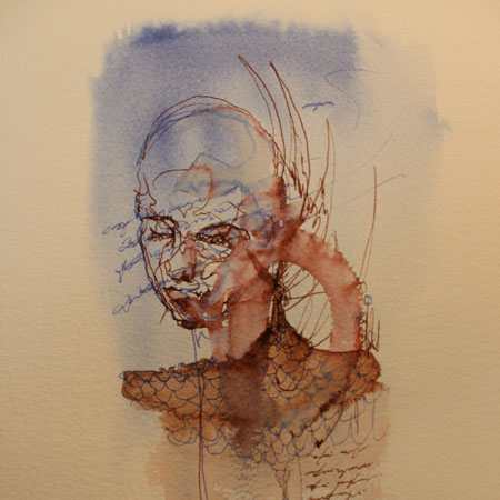
Ink 1 seems an unusual piece for you: a solidly defined block of blue and quite dense ink for the shoulders. Again though, you have presented the shape of the head in a really great way within the blue. The blue square does fade on the right. Cool work, it looks excellent.
The harvest images are also very good: they have been carefully drawn and thats always nice to see.

I like your combination of fine line and washes, it pushes the boundaries of how each should relate to eachother. Obviously, the harvest studies do not: they are anatomically exact ie realistic presentations of the subject with less spontaneity than I have seen in the rest of your work. I think you usually work in a more graphic and fluid manner.
Ink 1 seems an unusual piece for you: a solidly defined block of blue and quite dense ink for the shoulders. Again though, you have presented the shape of the head in a really great way within the blue. The blue square does fade on the right. Cool work, it looks excellent.
The harvest images are also very good: they have been carefully drawn and thats always nice to see.
Thanks Anton it’s good to receive some constructive feedback too. Look forward to catching up with you at the 100sqft launch